Data-drivencommunity operations.
Five analytics dashboards covering members, content, engagement, revenue, and overview — so you can operate your community with data, not guesswork.
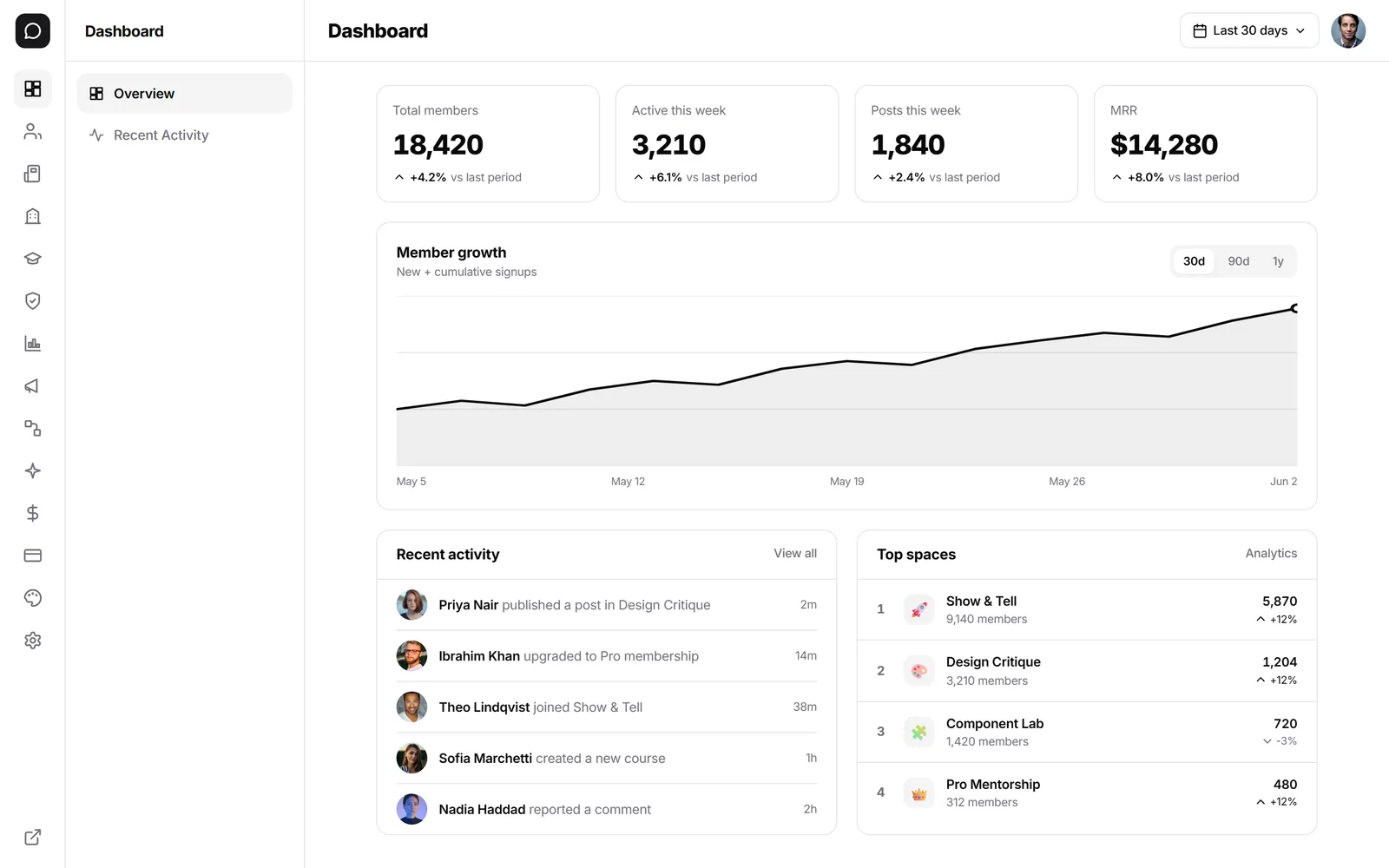
Illustrative figures from a sample community, not customer results.
Capabilities
Analytics built for community operators
Not a generic analytics tool — purpose-built dashboards for the metrics that matter in community operations.
Overview dashboard
At-a-glance metrics for members, engagement, content, and revenue — the first place operators look when checking community health.
Member analytics
Track signups, retention, active members, churn, and cohort behavior over time. Understand who is staying and who is leaving.
Content performance
See which posts, discussions, and resources drive the most engagement. Identify top contributors and trending topics.
Engagement metrics
Track activity patterns, session depth, space participation, and event attendance to understand where engagement happens.
Revenue dashboards
Monitor subscription growth, MRR, churn, payments, and transaction volumes. Connect revenue data to member behavior.
Export and reporting
Export data for deeper analysis. Scheduled reports and CSV exports for teams that need to share metrics externally.
Built-in vs external analytics
When analytics live inside the same platform as your community, the distance between insight and action gets much shorter.
| Dimension | Mateflow Analytics | External tool |
|---|---|---|
| Member analytics | Signups, retention, cohorts, churn — built in | Manual CSV exports |
| Content metrics | Top posts, contributors, trending topics | Page views by default; post and contributor metrics need custom events |
| Revenue tracking | MRR, subscription growth, payment history | Stripe dashboard separately |
| Engagement depth | Session, space, event-level activity | Basic visit counts |
| Export | CSV exports and scheduled reports | Exports its own metrics; member and revenue records live elsewhere |
Why native analytics change the operator experience
When analytics live inside the same platform as your community, the distance between insight and action gets much shorter.
Operate with data, not intuition
Communities that measure engagement, retention, and revenue patterns make better decisions about content, programming, and growth.
Connect engagement to revenue
When analytics and monetization live in the same platform, you can see which content and events drive upgrades and retention.
Identify problems early
Dropping engagement, increasing churn, or declining content quality are easier to fix when you catch them in the data.
Justify the investment
Whether you are a solo creator or an enterprise team, analytics give you the evidence to show community value to stakeholders.
Purpose-built views for different questions
Each dashboard answers a different set of operator questions, from high-level health to granular member behavior.
Overview
Key metrics at a glance — active members, new signups, posts, events, and revenue in one view.
Member health
Retention curves, cohort analysis, and activity distribution to understand member lifecycle.
Content insights
Top-performing posts, trending spaces, and contributor rankings to guide content strategy.
The dashboards
Five views, each answering one question
Retention asks whether people come back, engagement asks what they do, content asks what worked. Every view exports.
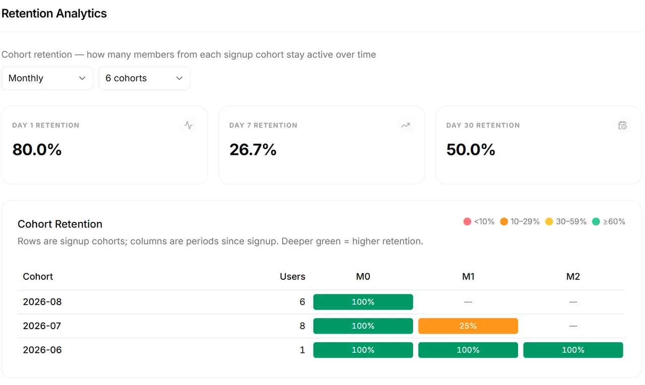
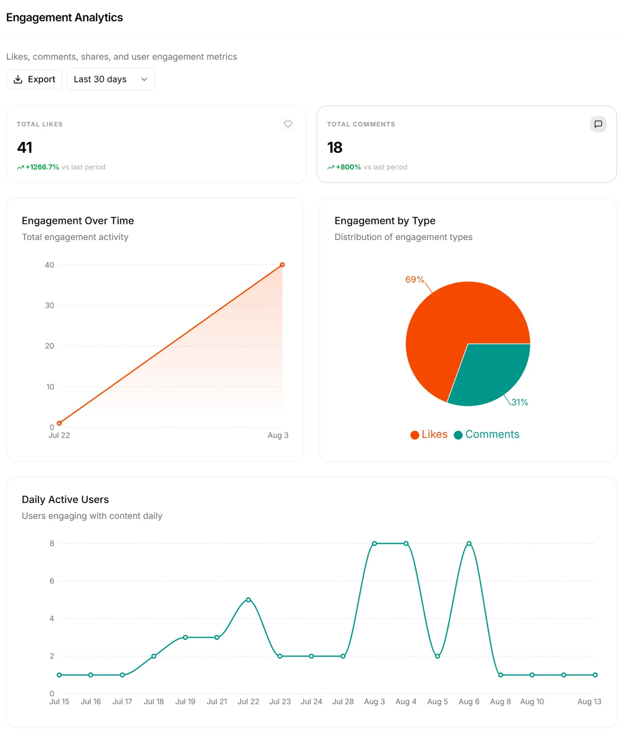
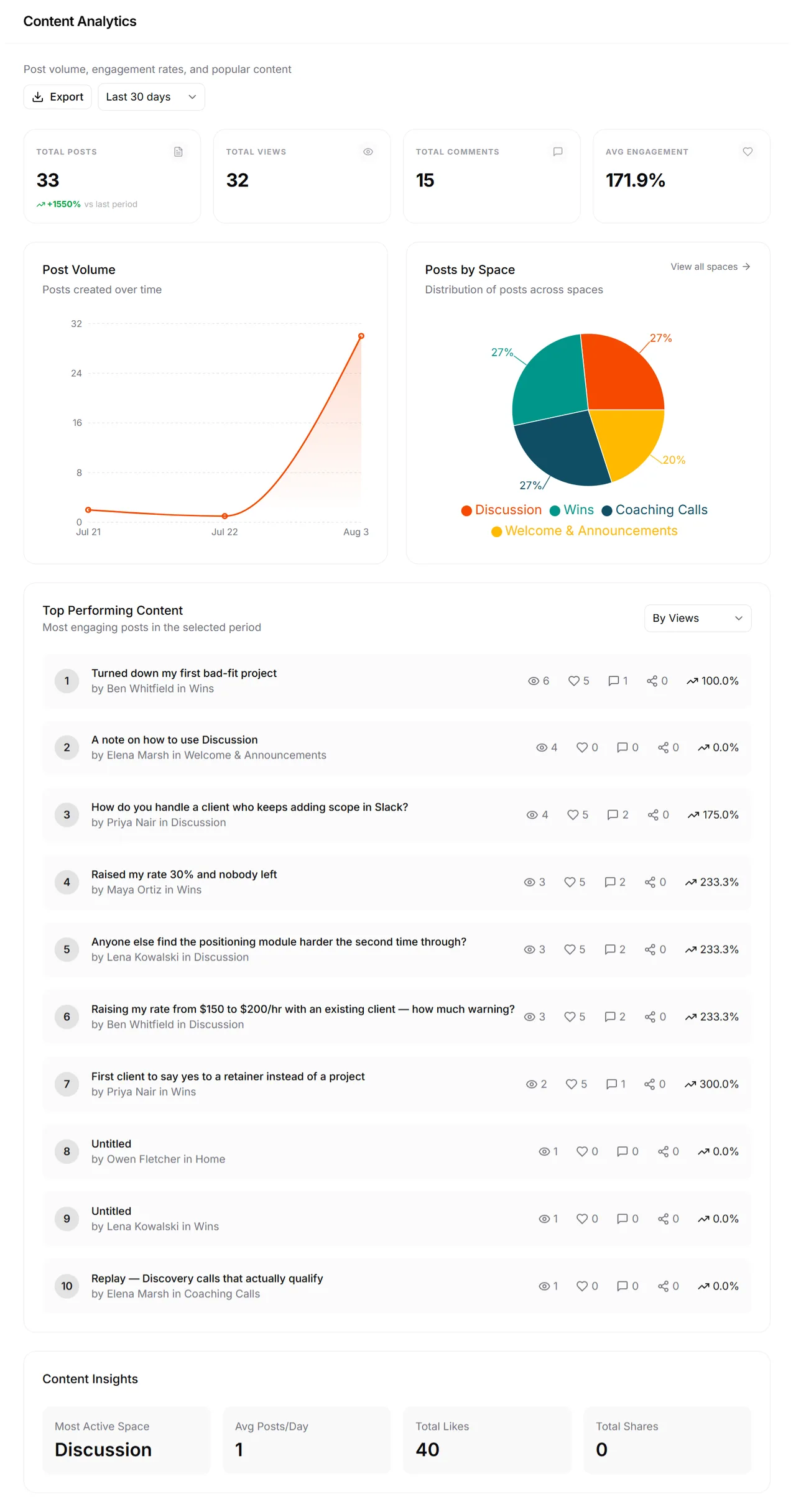
Figures shown are from a demo community, not customer results.
Analytics — frequently asked questions
What Mateflow's analytics dashboards cover: members, engagement, revenue, and exports.
There are five dashboards — overview, members, content, engagement, and revenue — purpose-built for community operations rather than generic web analytics.
Yes. Revenue dashboards track MRR, subscription growth, churn, and payments in the same platform as engagement data, so you can see which content and events drive upgrades and retention.
Member analytics track signups, retention, active members, churn, and cohort behavior over time, so you understand who is staying, who is leaving, and how each cohort behaves.
Yes. You can export CSVs and schedule reports for teams that need to share metrics externally. Advanced dashboards and exports are available on the Growth plan and above.
Analytics are included on all plans from day one, with advanced dashboards and exports unlocking on the Growth plan and above.
Operate your community with real data
Start with a 14-day free trial. Analytics are part of the platform from day one.